reflection moodboard
|
|

|
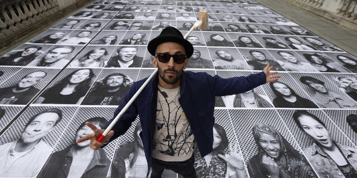
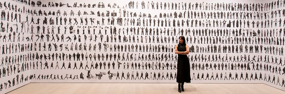
JR
JR is a TED Prize winner, Oscar nominated filmmaker, and one of Time's 100 most influential people of 2018. Thanks to his photographic collage technique, he exhibits his work free of charge on the walls of the whole world – attracting the attention of those who do not usually go to museums. JR has created "Infiltrating art". During his collage activities, the local communities take part in the act of artistic creation, with no stage separating actors from spectators. The anonymity of JR and the absence of any explanation accompanying his huge portraits leave him with a free space in which issues and actors, performers and passers-by meet, forming the essence of his work. |
JR CHRONICLES-SAATCHI GALLERY
|
The Saatchi Gallery showcased JR :Chronicles, from his early grafitti work, 'Expo 2 Rue' 2001-2004, to more recent work, Inside out;which is a global participatory art project and Chronicles, which speaks for politics, Gun Crime and other challenging themes.
JR's work difers from the norm of average artists trying to make a chnage and takes a wider look at the world of aspiring artists and global issues. He freely exhibits his art to communities both legally and illegally. The S.Gallery expresses his work openly, providing videos, photos and talks from JR. It is ordered chronologically so that you can move and watch JR as he grows into a motivational photographer. |
|
JR PROJECTS


These three images are most inspiring to me due to its sigifcance and peculiar representation.
Portrait of a Generation Response
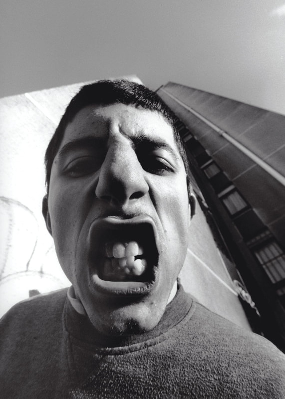
One of JR's first projects.
In 2004, in search of places where no-one would expect to see art, JR held his first exhibition on the walls of Les Bosquets, the ‘ghetto’ of Montfermeil, a suburb of Paris.He photographed its young inhabitants and pasted enlarged photocopies to the walls.
He aims to change to view stereotypical view of delinquents and Portrait of a Generation invited us to look into the eyes of men playing bad boys. With a certain ‘in your face’ rudeness, the portraits provoked passers-by to question the media representation of them. Were they promising students or thugs?
Good section well done
Portrait of a generation Response cont.
My aim is trying to distort and change the perception of the common pedestrian or friend from the outside world.
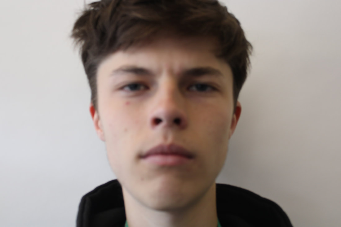
This is the original version being the rasturbated effect. Although out of focus it still managed to transform into a successful rasturbation.
|
|
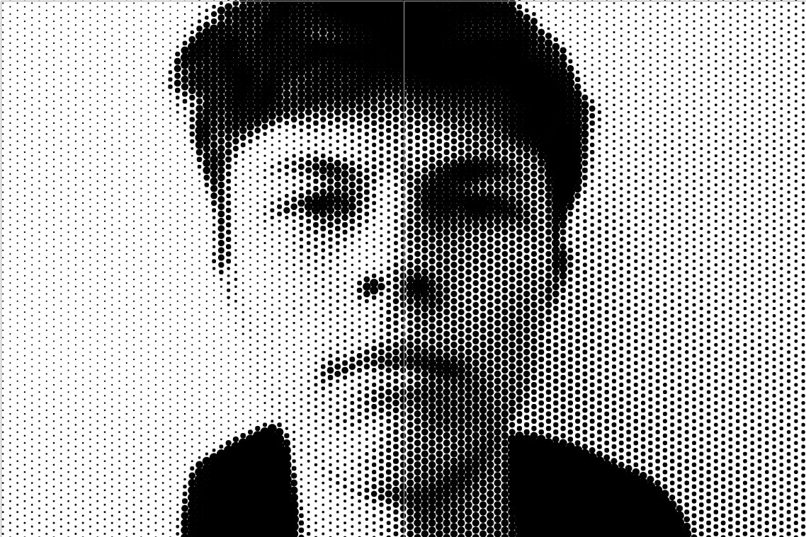
My process
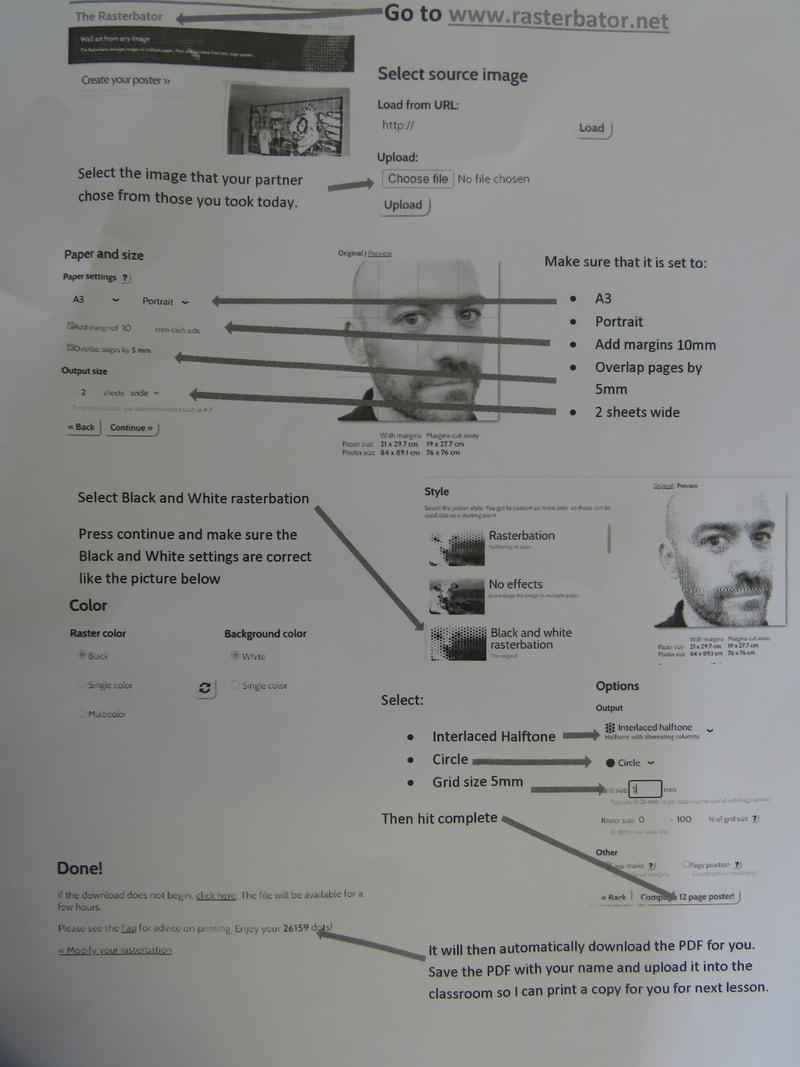
Using the website 'Rastebator', I was able to Rasterbate my image (the circle pixel effect) and change the filter to black and white and interlaced halftone for the shading. I blew it up to A3 onto four different contact sheets.
My printed final piece around school
|
|
WWW- I liked the slow shutter speed that captures the blur of the people walking past.
EBI- I could've been more creative with where I placed my photo, e.g a park walkway, local high street. Basically outside my school environment |


Gordon Magnin
Gordon Magnin is a Nevada based artist who works in photography, scans, collage, and altered found image. Magnin’s interest lies in the inventive use of geometry, pattern, repetition, form, perspective, composition. Magnin frabicates work that is a flawless combination of his education , talents and his environment
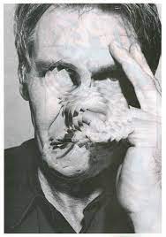
This work shows a continuous series of abstractions through the mediums of collage and photography.
|
These images, intially intended to distort public perception, are altered to heighten mystery and defy closure with a new sense of ambiguity.
|
It warps your view and brings
an enhanced idea into your mind. |
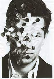
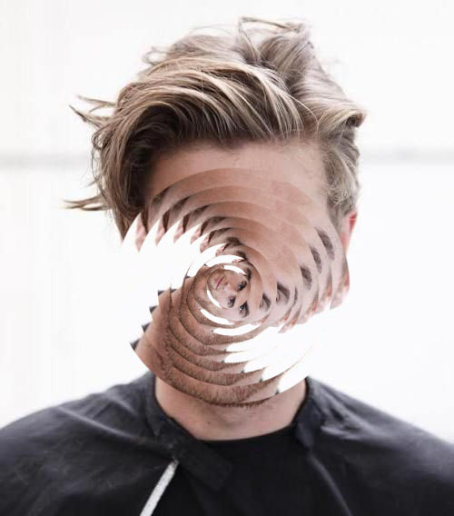
Geometric Portraits - Digital
My initial response on a model stock photo
|
|
WWW- the oval created a nice spiral shape which created a fitting distortion on her face, the differences in toning also added a more interesting factor to it, in both black and white and neutral.
|
EBI- I introduced a more exotic shape to the pattern and centred the spiral more to be more exact as Magnin
|
My process

|

I separated the frames layer by layer, converted it to 30+ layers that had a copy of all the following layers, then deleted all the showing layers separately to show solely that layer and continued till I was left with the last one.
|
|
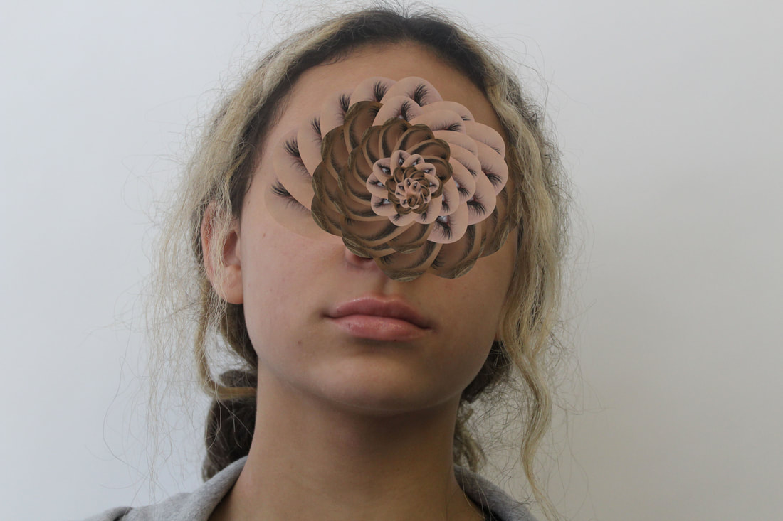
Geometric Portraits - Physical
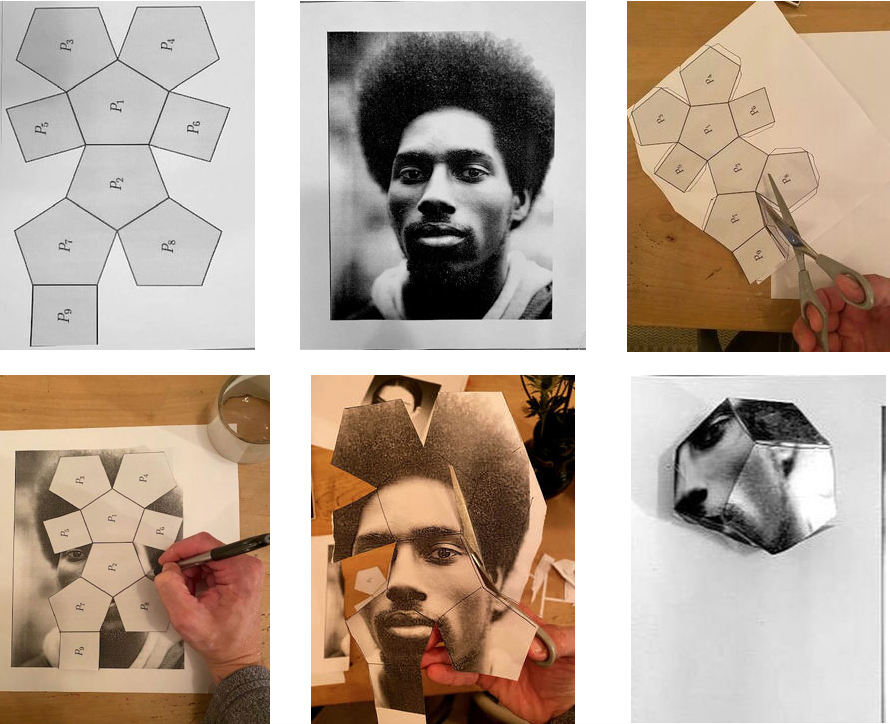
Alma Haser
Alma Haser
Alma Haser - Cosmic surgery is imagined as a medical procedure that people can choose in the not so distant future for aesthetic enhancement, mood alteration, and to thwart increasingly pervasive methods of surveillance. She suggests a fundamental shift in the way we understand ourselves and the world around us.

|

|


In this more practical hands on work, I copied Halser's work by using geometric shapes with origami to create a 3D abstract effect on a model portrait. I think i managed to bring the warped deatures forward out of the portrait and mimic Halsers work well
My process
WWW - I think I crafted a successful which managed to alter the view of the model,
EBI - I could've placed it in a more creative area to distort the viewpoint
EBI - I could've placed it in a more creative area to distort the viewpoint
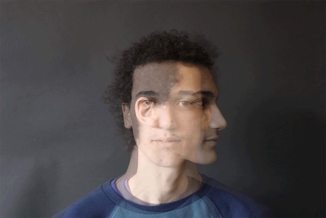
Daniel Samuel Stern - Collage

|
“David Samuel Stern aims to build a bridge between direct portraits and abstraction. This way of abstracting the images does not only offer his subjects a way to hide within themselves, but also turns digital photography into physical objects by adding geometric texture.
|
My response

I have weaved two identical pictures together to change the perception of my photo, it takes apart the image and recreates it in a more abstract way.
|

|
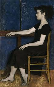
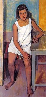
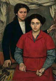
Kehinde Wiley
Kehinde Wiley uses the poses and props seen in traditional portrait painting. He finds his models on the streets of New York and asks them to choose a painting they want to recreate. Occasionally Wiley already has an idea of the painting he wants to copy in terms of the composition like the example on the left. These two works are set against each other in order to explore how ideas of race, masculinity, representation, power, and agency have played out across the history of Western portraiture.


Yannis Moralis
|
Yiannis Moralis was an important Greek visual artist and part of the so-called "Generation of the '30s".
|
|
My response of my chosen artist
|
|

This is my initial edit of Wiley's work, I was getting to know the surface and how to work the edit.
|

Second response to Wiley's work
Photoshop process

IN THE MAKING
WWW - I think on the first response I recreated the poem and imitation quite well
EBI - I could've improved the cut on the edit and smoothed it out to look more natural.
EBI - I could've improved the cut on the edit and smoothed it out to look more natural.
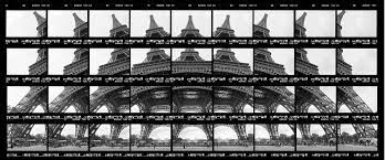
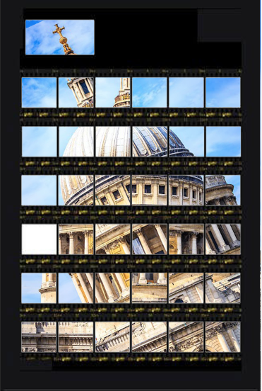
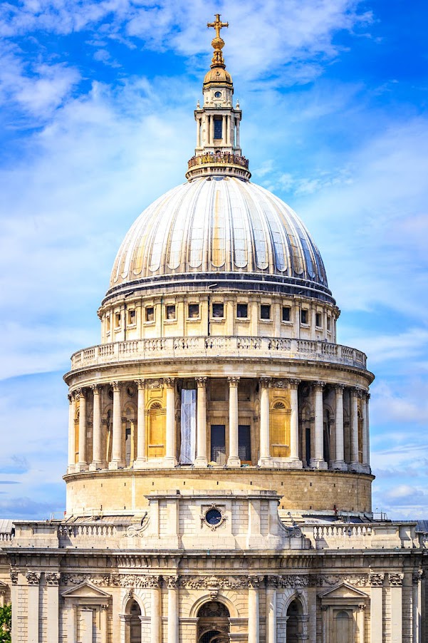
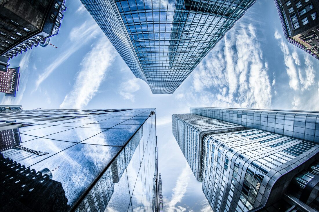
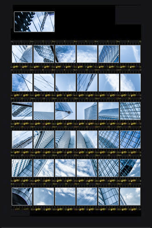
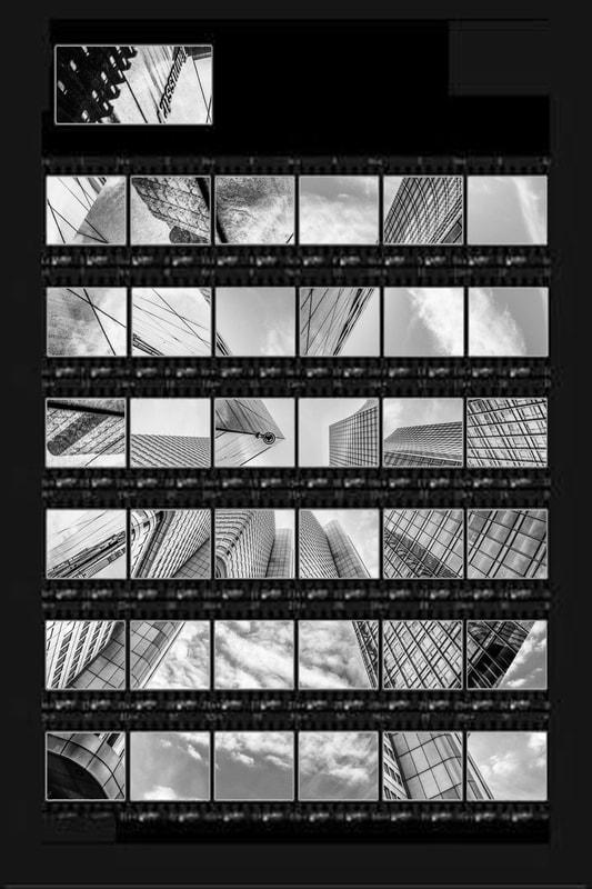
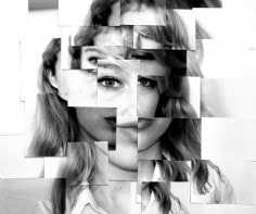
Thomas Kellner
Thomas Kellner is a German fine-art photographer, lecturer and curator. He became known above all for his large-format photographs of famous architectural monuments, which, through many individual images and a shifted camera perspective, look like "photo mosaics"

|
|
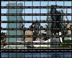
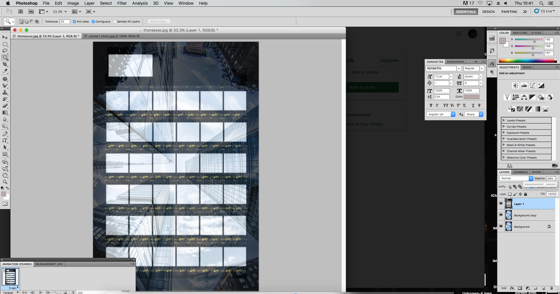
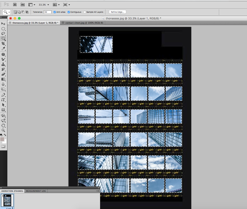
my response
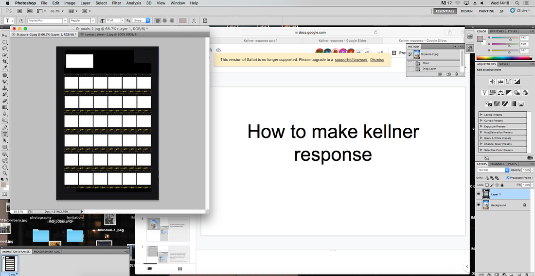
By using 'magic tool' you select and use shift to select all boxes on a contact sheet.
|
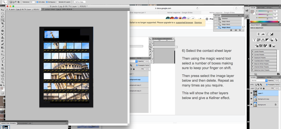
Once you have cleared those boxes, make sure you have multiple layers underneath of. your background. Then delete even more of those layers to reveal a distorted and triply effect
|
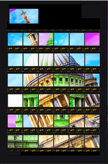
A final response with two underneath layers.
|
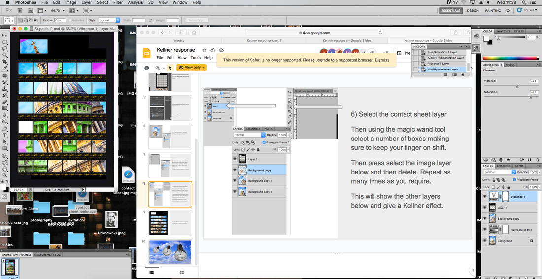
To spice up my image, I altered each backgrounds saturation, vibrancy, hue and lightness.
|
|
|
|
|
Second Response
I have added the opacity effect so that you are able to see the layers underneath.
|
This is when I have selected the individual white boxes and deleted them to reveal the bottom layers. This is the the magic wand tool.
|

Once I have personalised my Kellner response, I add on the back and white filter which is typical in his work.
|
original
|
nrml
|
blck&whte
|
|


|

Patrick Cornillet
Cornillet works with painting where the detailed realism of photography is united with sensuous brush strokes. His works investigates both issues concerning picturing and urbanity. He takes images of deserted buildings and isolates interesting shapes he sees inside.
|


|
My unedited responses

With some of these photos, I will make and edit my own version of Cornillet's work
Edits - I think the images I took work well with the area of work i've been given as they portray clear shapes and will be easier to work with
How too- these are taken with a basic shutter and aperture around local areas
WWW- good use of environment and discovery of shapes in the natural area
EBI- I used a wider spectrum of area of take the pictures to make the shapes even more eccentric
How too- these are taken with a basic shutter and aperture around local areas
WWW- good use of environment and discovery of shapes in the natural area
EBI- I used a wider spectrum of area of take the pictures to make the shapes even more eccentric
Response 1

Original

To create my final cut, I used the lasso tool on photoshop and line it up according to the abstract building shape. I then select the given area and fill it with yellow to isolate and solidify the building.
|
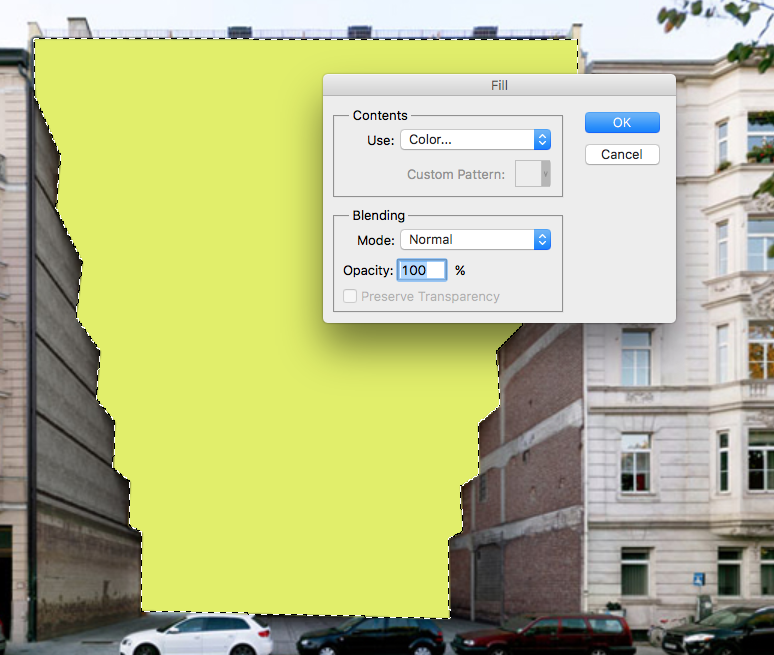
I keep it on 100% opacity so you are unable to see the background picture
|

Response 2
Continuing with the same method as my previous development. I choose the solidify the gaps of the floors and keep gaps of the background in between
|

|

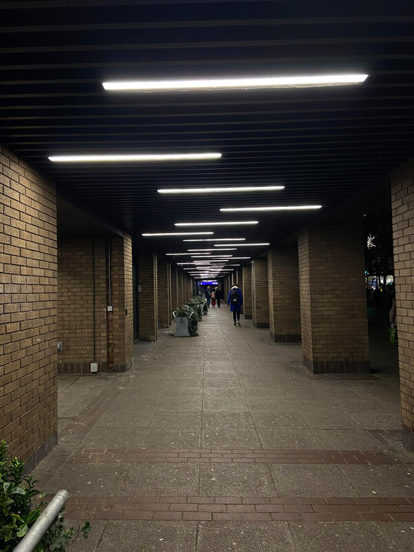
Aside- building reflection development

Original
|

To create this image, I had to lasso and cut out the walk way and pillars. I edited them out, isolated the lights and copy the shape left. With the copies of the lights, I rotate it by 180, and bring them to create a never ending effect. and I follow to fill the background with black space.
|

I think what went well with this response was that I was able to push my imagination and take hidden shapes from simple structures and transform it into a a sort of eye twister . I could've improved by using the blank space to my advantage
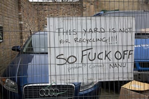
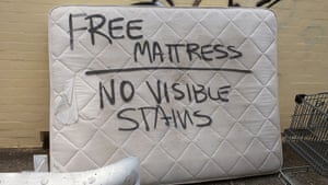
THREE STRANDS
|
a city-obsessed photographer who naturally gravitates towards the weirder aspects of modern life and pop culture.
|
|
My Response
I think my response managed to capture a range of artwork to satire around London, if I were to improve I would travel further out to even more parts of London and unravel its graffiti and the contrast between different areas around London and the seperation of class and diversity .
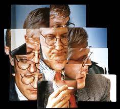
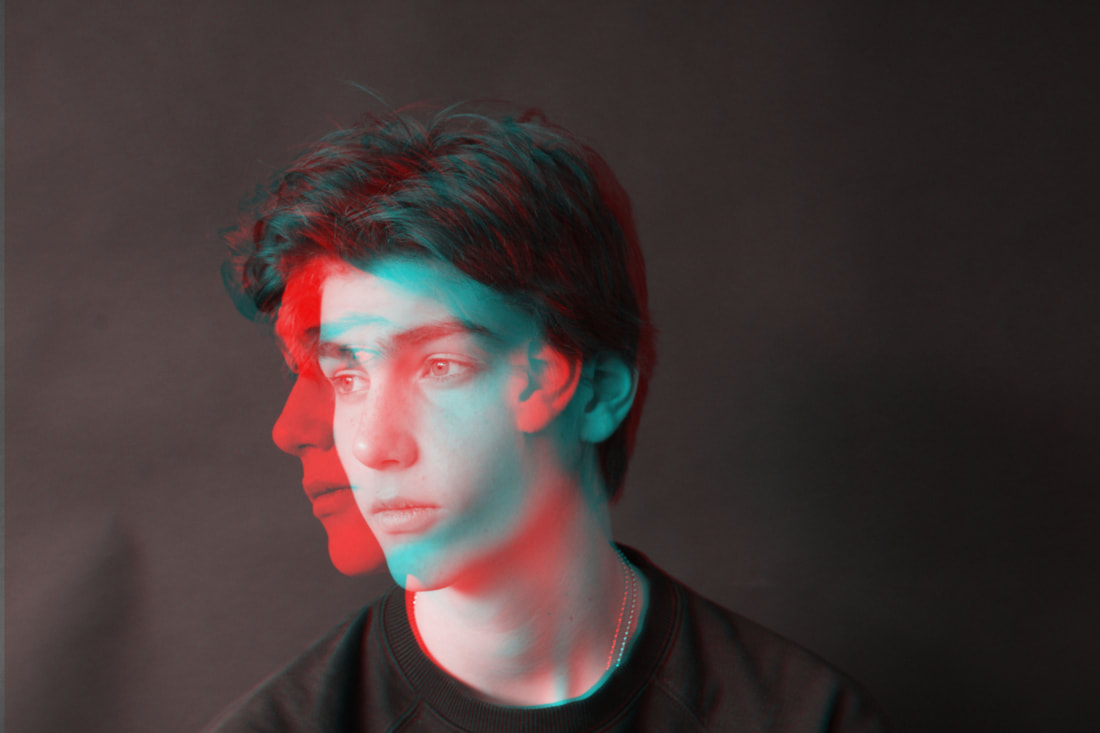
S2- David Hockney
|
Joiners aimed to create an image that was able to show reality how we experience it (in fragments, not as a whole), and to show the passage of time.
|
|
On my next response to this strand, I would say that to improve I should use a tripod to take more stable images so that the GIF is less wobbly and the effect of the alternating faces is more clear. Possibly even make it slower.
However I think so far as my first attempt the attempt manages to come through.
However I think so far as my first attempt the attempt manages to come through.
Response 2
GIF
GIF

A much more succesful response, The background is still and with a dark backdrop; it puts more attention on the model. I like this Gif as it is simple, every face is isolated but she carries the same face and postion and only changing the angle.
For my next response, I would change to aim of the Gif so that you as her face moves, the previous angles are still visible so that it is continuous
Response 3
Still
Still

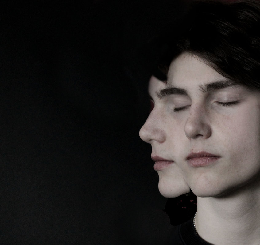
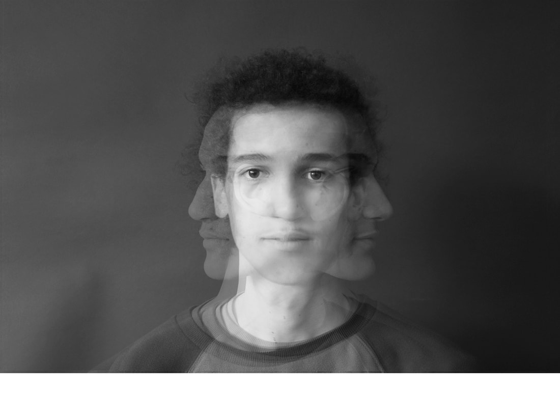
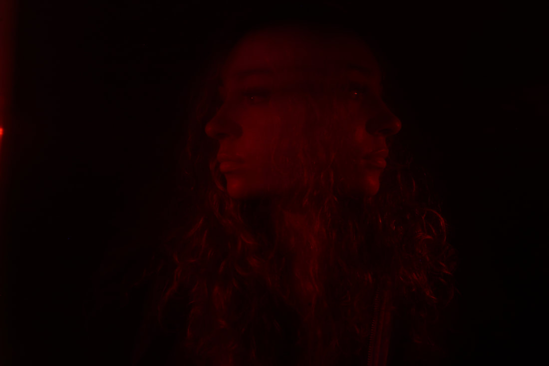
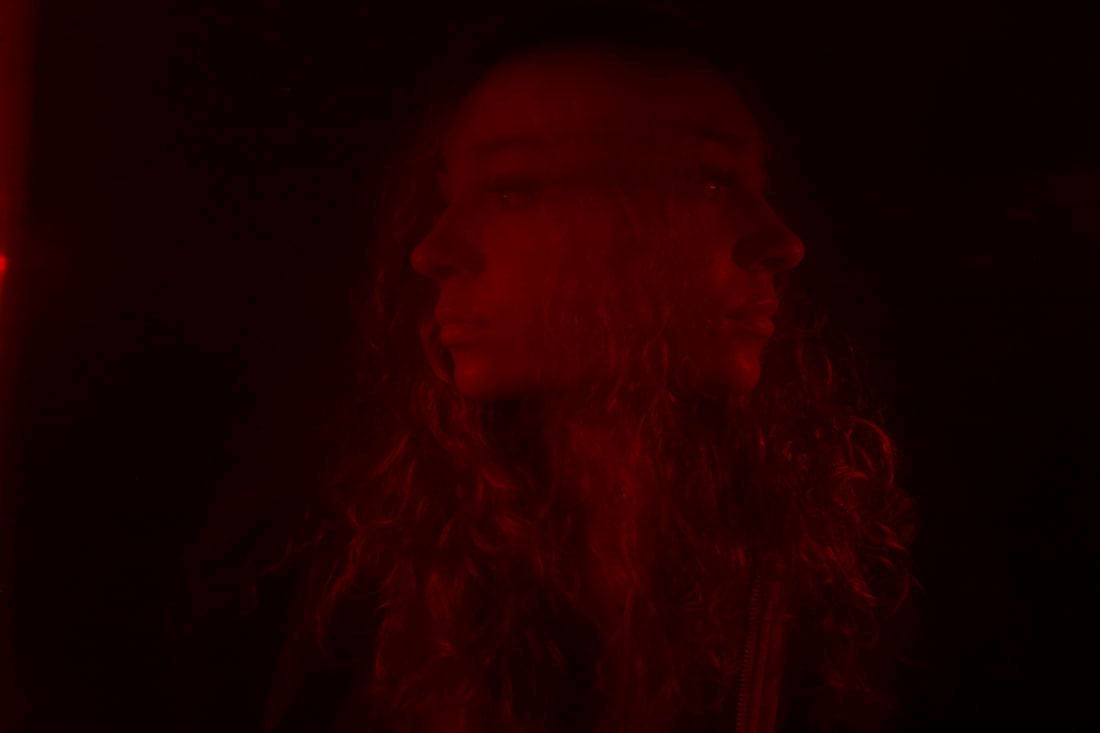
As my first attempt at a still, I think it was successful beacuse I managed to create the transition effect well and merge to two angles of his face together. The emptiness of the picture against a black background creates a dramatic cold effect which fits with the contract of colour (his skin).
However, to improve I would redo this image and make it a smoother cut between to two images and try to blur out the lines from the layered imaged, this was attempted with the b&w colour filter.
Helmo Response
|
Helmo approaches each project with a unique, playful and highly effective manner. In the project Bêtes de mode, Helmo produced a series of double-exposed photographs, featuring superimposed images of man and beast, which was displayed under the iconic dome of the Galeries Lafayette in Paris in 2006.
In my response, I aim to re-create his double exposure work with one of my classmates in response to my continuous Hockney series while I work with transitions and blur |
|

Response 4
Gif
Gif

By taking pictures of my models face at every angle, I aimed to create a looped Gif where you can continue to see the last portrayal of his face to make itseem likle a stretched out blurred effect and maintain every layer in the Gif.
I managed to do this by stacking the layers on top of each other in sequence and change the opacity of every layer so that every face is still visible as it moves along the screen.
What went well in this response is how i managed to keep each layer visible, especially the centre face which is the most striking.
What I could've improved, I think was the background movement and shoulder movement, which in result would have isolated his face and make the transition more bold.
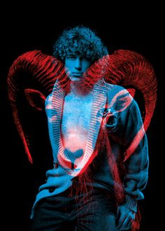
S3- Malick Kebe

|
Kebe has a strong understanding of shape, colour and concept, telling evocative stories with minimal subjects and small production. He takes his photos on an i-phone and uses Photoshop, Lightroom, VSCO and Snapseed to edit.
|

|
In this response, I am trying to mimic Kebe's work where he focuses on vivid colours against a background and his playfullness with movement. I will be using a light backdrop to put more attention on the object of the image (my model), which would in turn create a more shadowy silhouette on the model
In these images, I attempted at using a classic light as a backdrop and taking my image from underneath so that the direction of light was hitting downwards, trying to darken my central focus
However my goal was not achieved and I did not get the silhouette look I was looking for.
However my goal was not achieved and I did not get the silhouette look I was looking for.
I took a second batch a images for Kebe's work, instead using studio light, facing the direction of the background so that light is hitting of the background, and a coloured back drop to increase the contrast between the model and behind.
I think this response worked out much better as my model has a much more intense contrast against the coloured light.
I will use these pictures and edit them to darken my model and brighten the saturation of my background.
I think this response worked out much better as my model has a much more intense contrast against the coloured light.
I will use these pictures and edit them to darken my model and brighten the saturation of my background.
Photoshop edited
|

Photoshop edited
|
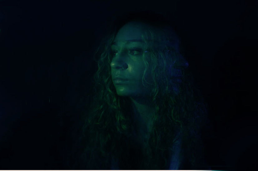
Sub-Strand - no artist


Edit
|
Original
|
Edit
|

Original
|

Process
|

Edit
I took the images below by using a slow shutter speed, to maximise the blur effect, shooting a flash on the positions of the head to make the angles bolder to sharpen the detail and then using tinted transparent plastic discs over the flash to brighten and colour the sides. A tinted disc was also used in front of the camera lense to filter the whole photo.
The two different discs were different tints to create a contrast between the colours and experiment.
The two different discs were different tints to create a contrast between the colours and experiment.
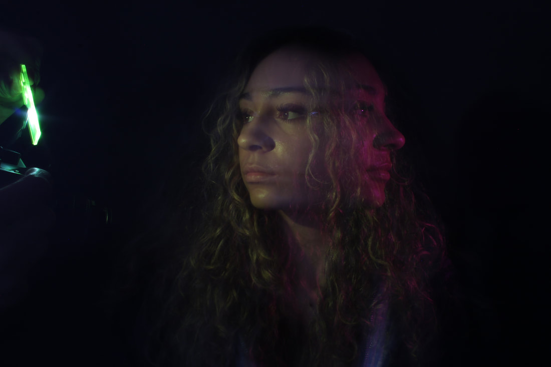
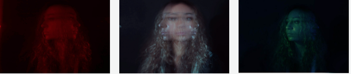
Christopher Schoonover- substrand from previous development
Schoonovers work here is focused on motion blur photography.
I will be focusing purely on the aesthetic purposes on his work and basing my responses off that.
I will be focusing purely on the aesthetic purposes on his work and basing my responses off that.

|

|
My Response
My aim is to mimic Schoonovers work closely. I use a white background as the back took over the filter and didn't give me the blur as well as the white background: which helps makes the coloured blur come through more around the silhuotte.
What went well with the white was the multicoloured shadow surrounding the sides of her face, which is what I was aiming for in response to Schoonovers work.
What I could've improved was to make that shadow more vivid and have a more prominent second blur silhoutte. I plan to improve on this in my second response.
What I could've improved was to make that shadow more vivid and have a more prominent second blur silhoutte. I plan to improve on this in my second response.
Separate Development
Inspired by Kebe's work, I am trying to focus on movement and light, but instead I have responded with movement using filtered lenses in darkness to create a more vivid and dramatic image.
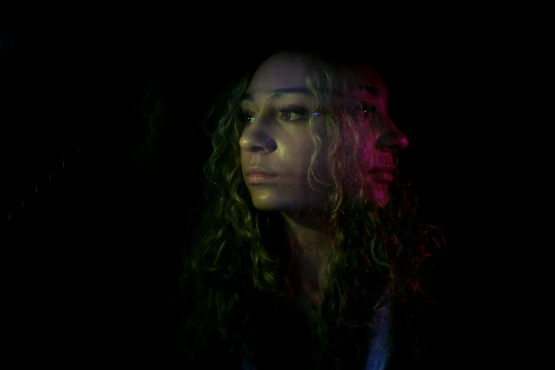
Best unedited responses


a favourite of mine as all faces remain distinct, and also the filetered lens wiuith flash that was used on the two external faces keep our attention of them both and give a better illusion of the blur which isnt so present in this take.

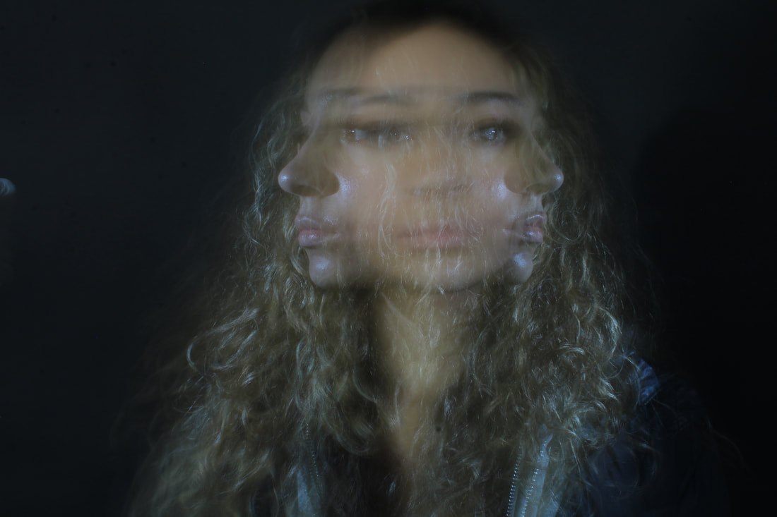
Photoshop edited
|
not a significant change in this image but i think the change of filter made a big differance as it made both faces very pronounced and unique.
the subtraction of the green light brings the focus back on the faces
|
|
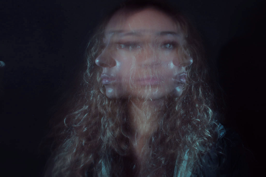
the change made in this take brings out more empahsis on the back two faces by making them more sharp, but also still maintaining a focus on the middle face.
This is a good example of my desired effect as it creates a good blur effect while still keeping its sharp feautures.
|
|
not much change again. simply bringing out the left hand face more and brightening the image to make it more clear.
|
My process
This is the process which i took to photoshop the responses, This was create a bigger contrast with the colours and the background .
In these examples, I altered the hue, saturation and colour balance. Meaning I altered to concentration of different colours inn the mid-tones, shadows and highlights for different colours to come through

The use of the clone stamp was to black our the green light that was left in the picture which was there to give the image its green/red filter.
|

|
This is a second edit of the picture above which has also been altered by color filter.
I think what I could improve on this edition is to make the second right hand face more notable by possibly brightening the image or changing the colour tones.
I think the chosen hue and colour filter suits the image well and brings out the first left hand face and gives the image a more dramatic effect.
I think the chosen hue and colour filter suits the image well and brings out the first left hand face and gives the image a more dramatic effect.
Artist & Me
Malick Kebe
Malick Kebe

Kebe
|
Me
|
In this development, my aims were to recreate Kebe's work with colour and shadows. While developing and improving my responses, I incorporated movement and blur. I moved on to taking my inspiration of Kebe and doing my own work, by using concepts from other artists and building on it.
In my final pieces, I think there is a clear resemblance of mine and Kebe's work as we both manipulate colour and light.
Final Piece
Malick Kebe inspired work
Malick Kebe inspired work


Some good work here but please remember to introduce each response with what your intentions are and how your work links to the artist that you are looking at. Also make sure to complete your WWW and EBI at the end of each section.
The three strands need work the Hockney sections needs to be refined the gif is okay but I wonder if using these images in a still photojoiner would be better try experimenting with this and if you need to take new images please do so. ALso consider the two link below that show artist to look at with possible ideas for development
https://www.pinterest.co.uk/pin/293226625738700629/
https://www.brandpowder.com/paper-surgery-anamorphosis/
Also the rubbish London work is good and could definetly be developed further look at the artist link below and consider them in developing your work further
https://www.huffingtonpost.co.uk/2012/12/07/shit-london-2012-patrick-dalton-worst-capital-pictures-_n_2256371.html
Finally you need to complete the sillhouette work this can be done in class look at Jack Gs weebly for examples of how to do this
